OutboundEngine
OutboundEngine is a late-stage SaaS start-up that provides a suite of automated marketing tools for small businesses across 14 industries. When we engaged with the company, they were the fastest growing start-up in Austin, but they were starting to feel the effects of a brand and marketing they had outgrown. One of their biggest mishaps – one that can be common for tech companies – is that they focused too much on marketing features instead of focusing on what made the product truly valuable to customers.
Working from the results of an intensive research and identity writing phase at the beginning of the project, we developed a new system of messaging and copy and a new visual identity, redesigned their website, and worked with their marketing team to roll this out across all channels, as well as transforming the physical spaces in their Austin and Scottsdale offices. I led research and strategy for the project, co-led a team of UX designers, visual designers and developers on execution, and collaborated with client-side designers, engineers and marketers to ensure a smooth and coordinated rollout of the new brand.
Mural Design & Illustration Style Development
Research & brand strategy
In order to inform and focus our efforts, we conducted a research and discovery phase that involved a number of key components aimed at developing a deep understanding of customer needs and preferences, the current product offering, marketing and branding, and their competitive landscape. This work included:
A questionnaire and multiple discovery sessions with the core stakeholder group, which included the CEO, COO and marketing director
Employee focus groups with each department
One-on-one interviews with key employees
One-on-one interviews with current, former and prospective customers
SurveyMonkey survey of current customers with 100+ respondents
We conducted intensive synthesis to develop insights that we shared back to core stakeholders. One of the key takeaways was that most customers were not particularly focused on what the technology did – what they cared about is that it helped them get referrals, and it helped them be remembered by previous customers. This validated one of our core assumptions: that the brand and marketing should be attuned to customer needs and outcomes, versus highlighting the features of the product.
The insights we gained from our research served to drive stakeholder alignment as we moved into our work on the core brand writing – mission, vision, positioning statements, brand pillars, and voice guidelines. The consensus we built through the insights we shared via our research and synthesis, and the resulting identity statements, became the bellwether for our efforts moving forward, driving internal focus for employees and external clarity for prospects and customers.
TOP-LEVEL & industry-specific Messaging
Building on the foundational identity writing, we worked to create a messaging schema that reframed OutboundEngine’s value proposition and focused on the users they serve. Core messages such as “never lose touch,” “a referral happens in a moment” and “a relationship starts at hello” spoke clearly and simply to benefits instead of features, and used real-world scenarios to make the value of the product relatable. They also spoke subtly to the emotional aspects of relationship-driven businesses that customers mentioned, serving to drive emotional affinity for the product and company. In addition to the core messaging, we developed industry-specific messaging to speak directly to benefits within each core vertical they serve.
Building Signage
Presentation Deck
Letterhead
Wayfinding Illustrations
Visual Identity
In translating the brand strategy to OutboundEngine’s new visual identity, we sought to balance the need to communicate a level of technical expertise and trustworthiness with a cordial feel that positioned the company more as a partner to their customers than as a service.
The previous logo included a visual representation of wings to accentuate the concept of “outbound,” but was a little too on the nose as it also depicted an email/chat bubble. In our concepting process we explored a number of full departures from this trope, as well as options that maintained a level of visual continuity. As we developed the type system and other core brand elements, we coalesced around a square mark that simplified the wing to its most elemental form. The wing was complemented by a bounding box that left the overall form more open conceptually, allowing it to represent various aspects of the product, but always with the energy of the “outbound” concept.
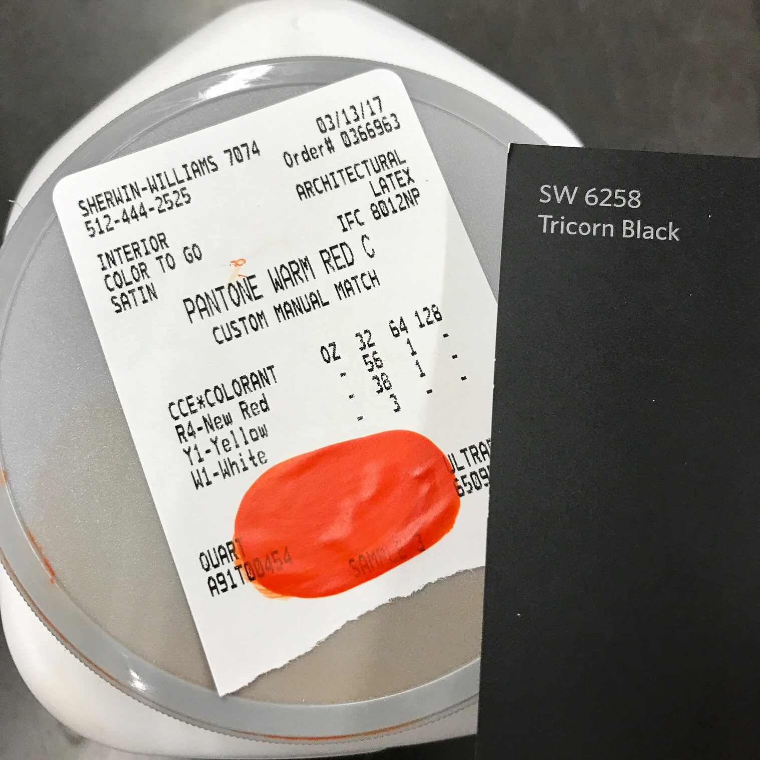
We developed a single-font type system using the typeface GT America that utilized exaggerated hierarchies, with its just-slightly-squared-off design lending itself to the techy yet still friendly feel we were after. The core brand system relied on a brand red, along with black and white, and was supported by a more playful color palette and illustration system that helped with wayfinding in marketing materials and the website, as well as the core product.
Marketing Website & digital Applications
Overlapping the later phases of our visual identity work, we began to translate our strategy, messaging and design frameworks to the digital sphere. OutboundEngine had in-house design and development resources at their disposal, so our team focused on creating a core UI system, and a corresponding digital style guide and component library, that their in-house designers and developers could leverage to complete a full site redesign and launch.
We used the homepage sequence and two additional page templates as the testing ground to ensure we covered all core components, such type styles, colors, buttons, cards, illustrations, and form styles, as well as all menu systems. We delivered a SASS-compiled digital style guide that served as a reference point for designers, and a place where developers could directly pull component code for use in implementation.
UI Design Language
Digital Style Guide & Component Library
Internal brand rollout
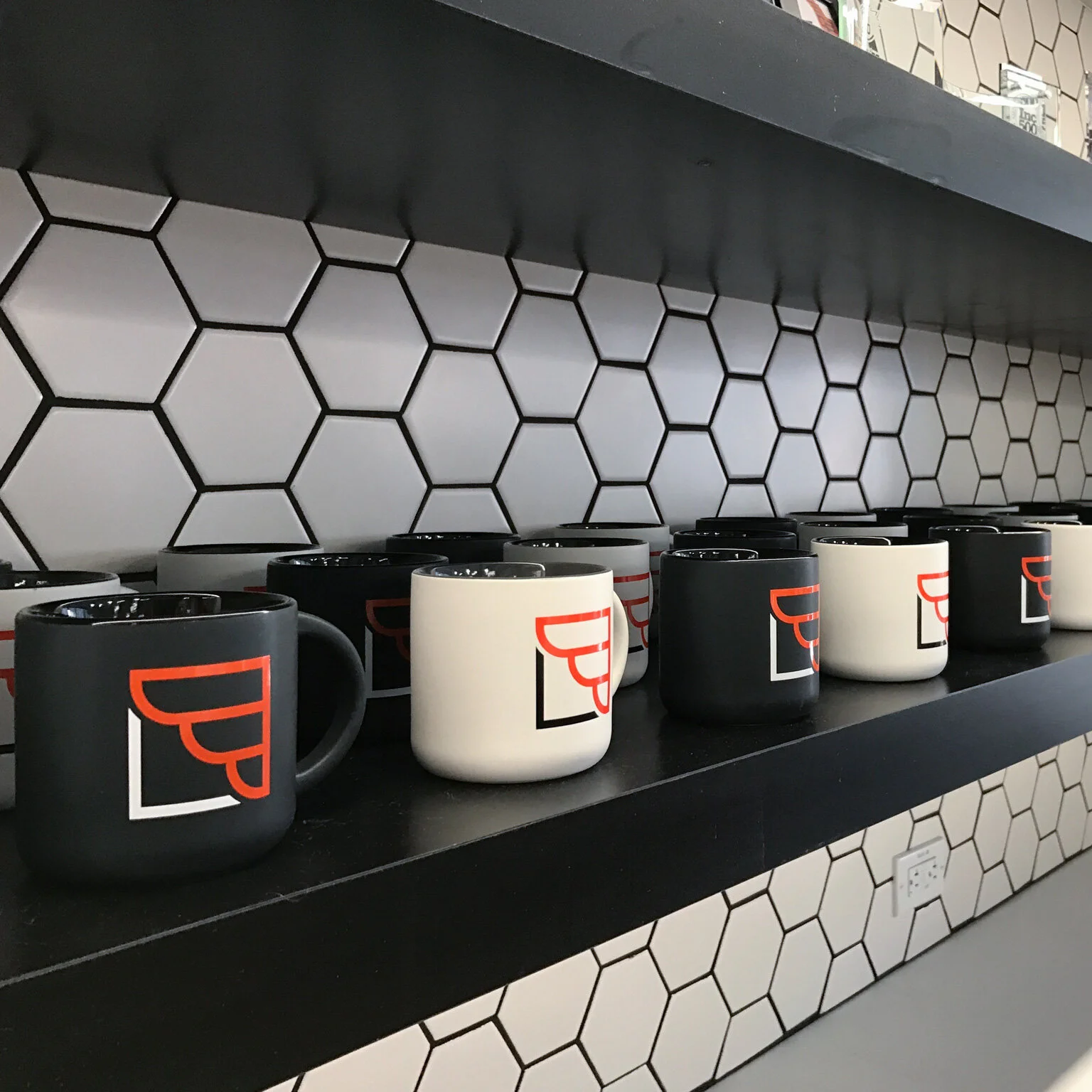
A key component of the rebranding strategy was aimed at energizing employees and driving alignment across the company. Our stakeholders came up with the idea of a complete transformation of both offices over the course of one weekend; employees would leave on Friday and come back to some big changes on Monday. We developed a suite of environmental updates, including signage, murals, wayfinding and branded accents, as well as a number of swag and branded items that were given to employees and placed throughout the space. We worked directly with vendors and the OutboundEngine team over a (very involved) weekend to realize this transformation and surprise employees the following Monday.
Results
Our work drove a new, unprecedented level of alignment across the organization. We saw the sales, customer service and marketing teams adopt unified messaging and scripts for the first time in the company’s history, while engineering also adopted a number of components of the design language into their product development. Our team received high praise from the CEO and executive team, as well as the marketing organization, for delivering a brand system and design infrastructure that all of their teams were able to leverage and apply successfully in their daily work.


